What Do You Know About Colour Theory?
Colour theory cannot be defined by one singular concept and encompasses a multitude of different interpretations, ideas and applications. However there are three simple but vital categories of colour theory that are particularly useful to know and can be applied to your artwork: the colour wheel, colour harmony and how colours are used. Don’t worry, we aren’t sending you back to school, we’re just giving you a few things to think about that can hopefully help expand your artistic abilities
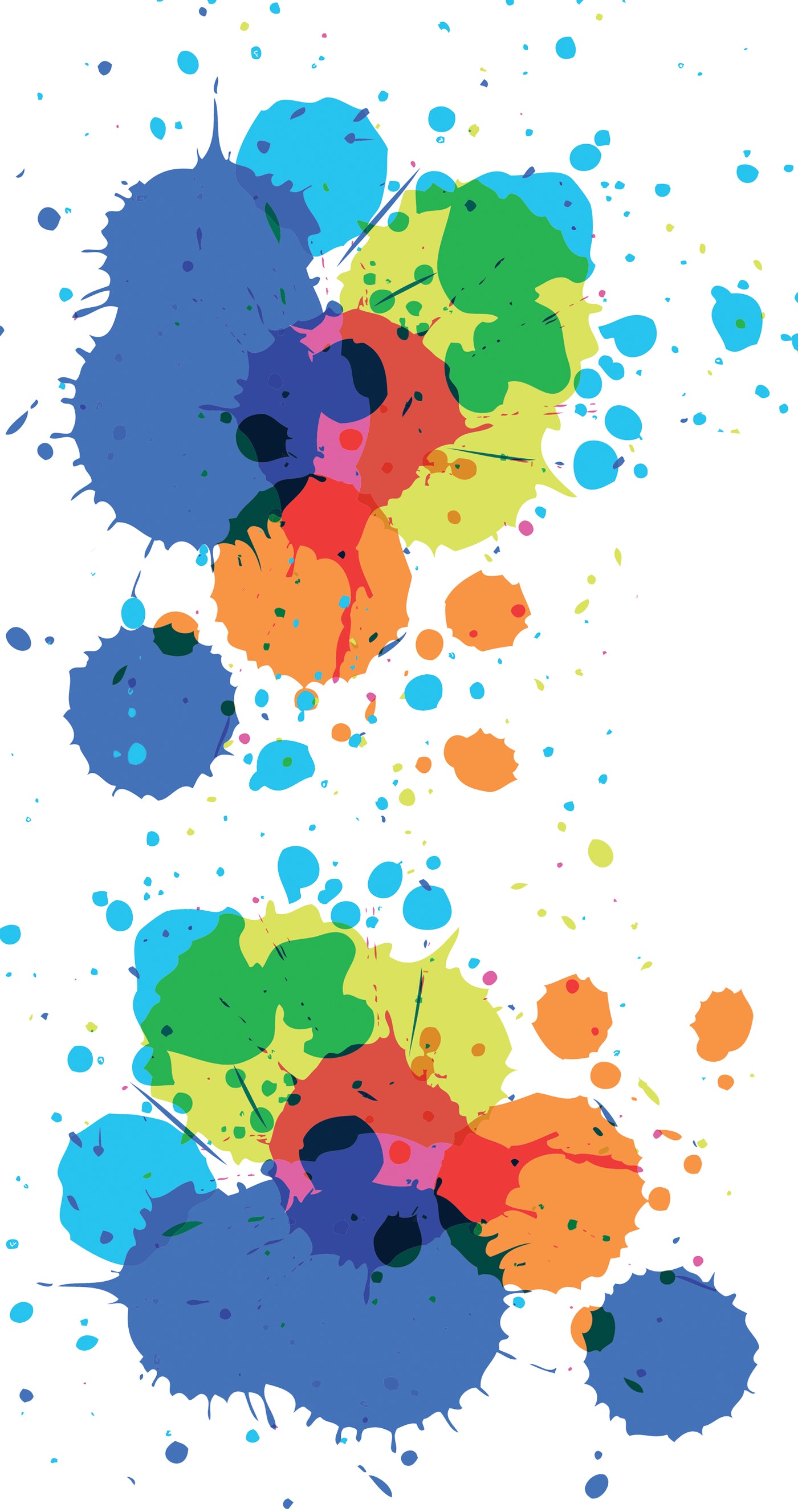
The Colour Wheel
As something most of us will recognise, the colour wheel is a circular diagram and is a way in which we organise colours in the traditional field of art. It was first developed by Sir Isaac Newton in 1666 and has been modified and refined over the years into what we know it to be today. The colour wheel that is most universally accepted is made up of three main sections. These sections consist first of primary colours; blue, red and yellow. These are considered the three dominant colours that cannot be mixed or formed by any other combination and all other colours can be derived by these three. The second section are the secondary colours; green, orange and purple. These are created by mixing primary colours. And the final section are tertiary colours; yellow-orange, red-orange, red-purple, blue-purple, blue-green and yellow-green. These are made by mixing primary and secondary colours and often do not fit into one single definition.
Colour Harmony
The concept of colour harmony is based on a visually appealing arrangement of parts. Finding colours that compliment each other can engage the viewer and creates a mental sense of order and stability. Just like a composition that brings clashing colours together can create a sense of chaotic disharmony. There are many formulas and ideas for colour harmony but here are a few to consider in your artwork. The first colour scheme is a monochromatic combination, in which all colours included are derived from a single hue. This will extend to using shades, tones and tints to expand the palette and will create a homogenous and stable feeling image. The second is a colour scheme that centres around analogous colours. This combination consists of any three colours that are next to each other on the colour wheel, for instance yellow-orange, orange and red-orange. This combination can be a very amicable blend and can often bring a sense of unity to a subject. And the final colour scheme that is useful to remember focusses on complimentary colours. Complementary colours are any two that are directly opposite each other on the colour wheel, like red and green, orange and blue or purple and yellow. When these are placed next to each other they create the strongest contrast and can be the most visually stimulating for the viewer. Of course, there are many more colour schemes to consider but these three are a great starting point for your compositions.
Colour Context
An important factor in creating a pleasing composition is how colours react in contrast to others. For example, colours can often appear brighter or duller when layered against or on top of a different shade (complimentary colours make the subject appear brighter whereas analogous colours will mute and blend into each other). Colours also have the ability to affect how others are perceived. This theory is demonstrated perfectly in a few optical illusions, in which the same toned and shaped object is seen with different coloured lines running through. These lines influence the brain into thinking that the objects are all different colours when in reality they are all the same. Observing the effects that colours have on each other and how this can cause noticeable differences in our perception, is something to consider in your artwork.
Aspects of colour theory are vast and ever growing and though most of the principles are fairly simple to comprehend, putting them into practise can be complicated. It is something that many do not think about but colour is such a fundamental part of not only our artwork but also our lives, so having a basic notion of understanding can give us a much richer and stimulating visual experience.